

play board games
Board game reviews, strategy tips & session reports
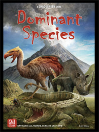
Dominant Species Third Printing
 I reviewed Dominant Species a while ago, but recently GMT has updated the art. I thought I’d give a quick comparison between these last two printings.
First, in case you have not played Dominant Species or read my previous review you can check it out here. Though the rules have not a changed in the latest edition, many of the components have.
The board is no longer tan, but an icy blue. The new art has more contrast and the new board helps the new tokens and tiles stand out.
The tiles are more glossy, have new backgrounds and have the scoring right on them. The new tile patterns do make it easier to differentiate between them, but the scoring track is a bit too dark on most of the tiles.
The art on all cards and tokens is more realistic and seems less hand drawn and cartoony. This is good in most cases but there are a few instances where I prefer the older, simpler art.
The cards themselves are darker. The background is dark brown with light text which might be hard for some people to read. The overall layout of the cards is much better and as I said above the new art looks nice.
The wanderlust tiles actually say wanderlust on the back which makes it easier to identify what action they relate to.
If you disliked the old artwork or have yet to buy Dominant Species you should check out the third printing. You will appreciate the upgrades and get a great game at the same time.

Leave a Reply